Showing posts with label blue. Show all posts

Sunday, August 12, 2012

Colors of Power: red and blue- History of Color in Middle Ages # 9


Red and blue, most prominent color duo of the Middle Ages. People just loved them so much, that even when writing about rainbow  they wrote often only blue and red! Also the existence of separated guilds of dyesrs dedicated for each color may be a testimony for high esteem and priceses of those particular colors.

 We see here in the video the colorful splendor of the Middle Ages, about illuminated manuscripts about British royals. Lots of color, but most prominently the duo of red and blue. Fresh colors, most of the time.Video window may not come up in an instant.
Interesting movie by BBC about royal illuminated manuscripts.

Here Charlemagne is  being crowned.

Emperor's Charlemagne Coronation, Illuminated mansucript, via wiki commons

Red and blue were colors of power in the secular world, why?  Red and blue dyes were expensive, not common, and people loved those hues, of course. Red was used after the purple of Tyre, very expensive and reserved only for the rulers, became less and less available. Red in a more dark, dignified edition was replacing purple,which had a brownish tinge, not what we commonly classify as purple today, until appeared in its pure form, lighter and brighter. As we see bellow, on the Annunciation picture.The same with blue, it was considered a very noble color, and as the blue dye became to symbolize affluence and also royals were using it. (Royal blue).


Announciation by Petrus Christus, via wiki commons


Here on this Anounciation by Petrus Christus we see Virgin Mary dresses in a red mantle. We see the typical elements of Announciation, as the lilies signifying Mary's purity, the vase a pure vesel, open book also is traditional. Always opened on the same page on all paintings, Isaiah 7:14, or psalter pages in earlier book. Other written words is the passage from Announciation of the New Testament, the words spoken by the archangel ("Ave Maria,  gracia, plena"etc) was directly written in the picture. Mary is here depicted as a fine lady, dresses in a rich garment, expensive mantle.  Click here to read more about Announciation symbolism.
This painting is considered early Northern Renaissance, but still has elements of Gothic art. For example the folds of the robes of the angels are still very hard and geometric, the angel's posture is typical for Medieval art, also his wings, strong color, not white. But we see already linear perspective on the tiles of the floor, increased realism of depiction in painting, eye for detail.


Court scene from November,  Book of Hours of the Duke de Berry, Via Wiki commons


What a rich blue wears this duke! Probably he is the Duc de Berry himself, it is a miniature by Limbourg brothers, form the Tres Riches Heurs di Duc de Berry, form the magnificent manuscripts collection of the Musee Condee.
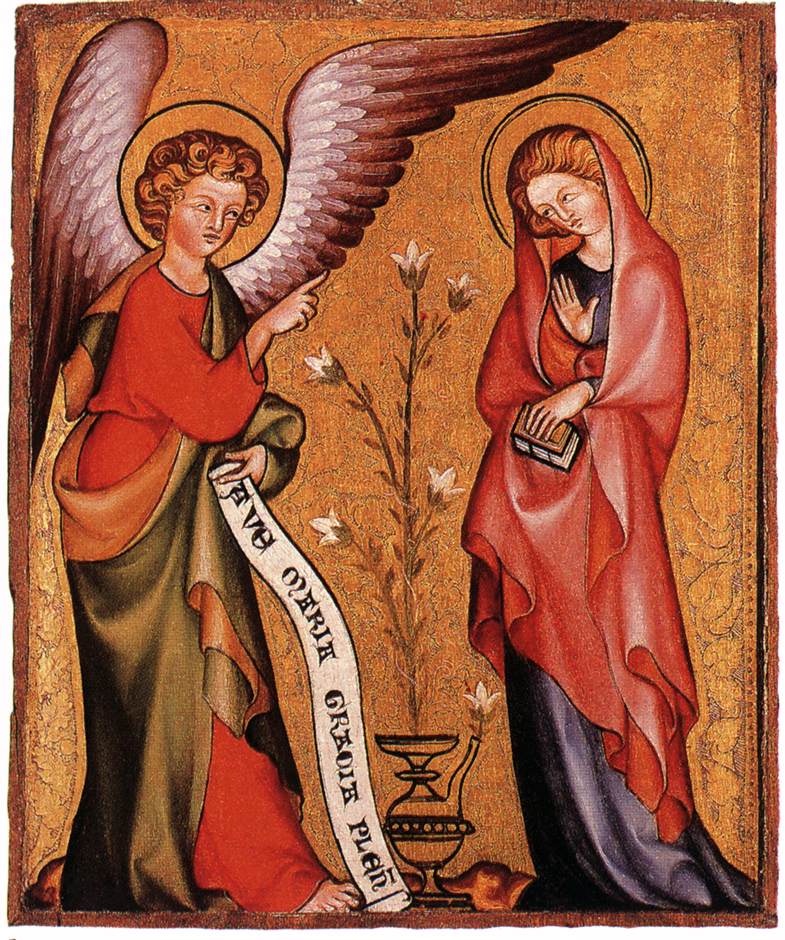
                                              
Announciation, unknown German Master, via wiki commons


The Announcaition again, this time we see all elements traditionally depicted in announciations, but this time the book is  not opened, but text is written on the banner held by the archangel.("Hail Mary, full of grace"). this banner as a speech bubble appears often.Wallraf Richttarzt Museum Cologne. Mary with a book again, it has significance, depends if closed or open, etc. Soon about Mary and book symbolism, an elaboration on this  important element of  iconography.

Altdorfer, Virgin Mary with Child, XIV.c via wiki commoms
Virgin Mary as queen, with infant Jesus in her arms, by Altdorfer, (German), museum in Budapest.Infant Jesus has a necklace symbolzsing his future Passion and death on the cross (coral ) which in secular symbolism and superstition of the days: it  was supposed to avert evil. The apple is relating to original sin, held by Jesus is a symbol of redemption, eradication of sin.
Death of the Virgin, by Konrad von Soest, Mary on her death bed attended by humans of saintly and common stature, and by angels themselves. We see richly embroidered blue mantle and blue angels, as the symbols of heavenly realm.Also prominent is red/blue color duo, gold background. Closed books also present, symbol of the Virgin. What is written on the open scroll, which is read by bearded man dressed in red, with his head covered as sign of respect and humility? The paleographers would tell. The saint whose hand holding quill  is almost touching Virgin's hand is, has "Saint John the Apostle" written on his hallo.

Death of Mary by Konrad von Soest, via wiki coomons


Monday, August 6, 2012

Mary Magdalene: Blue Color of Her Robes and Art Historians

 Here we have Lamentation by Petrus Christus from Royal Museum of Art in Brussels. Can you recognize who is who among both Marys? Both have blue robes. Mary, the mother of Jesus is depicted as fainting, her body lifted up by two people. Common depiction, Mary fainting at the lamentation scenes. Is one of the people attending her the Mary Magdalene because she has red dress? Well... no. Color symbolism was common, but not set in stone, there was nothing very dogmatic about it. Please, click on "Mary Magdalene robes"  among the labels/links at the bottom of this post, you can read posts about the other colors.

Lamentation by Petrus Christus, via Wiki commons, click on the picture to view it larger


 But where is Mary Magdalene in this painting? You can recognize her by one of her attributes: the skull. She is the one turned toward the cross and the skull. Ointment jar is another attribute, not in this painting, the cup behind her is the cup for throwing dice, as dice are one of the symbols of Christ's passion. Both Marys are in blue, which was for sure costly, ultramarine was the most expensive of pigments. Both are made clear who they are, made recognizable: one by the pose, another one by her attribute. The viewers of those days knew how both were depicted, today those things are more confusing, as people have less familiarity with iconography.

This example of using so much blue is rather unusual for Petrus Christus himself. He most often used red for Virgin Mary's robes, as was common in the Northern painting. Blue was more common in France. This is of course rough division, the geography, but this is a  more factual explanation to clarify this red and blue vision, than color coding Virgin Mary and Magdalene rigidly.


Rather dogmatic is thinking in red and blue, which sometimes happens today, as art historians and art history buffs say. This means the idiosyncratic idea that Mary the mother of Jesus was depicted only in blue robes, and Mary Magdalene was depicted only in red robes. Luckily the Old Masters where not as limited, or as color blind.But some art historians complain that it is difficult for some people to understand this fact, and even those people will rather aggressively defend their pet idea, in spite the fact that their knowledge is limited.Why is it, and why some people are so fiercely attached to this specific color combination, is a mystery for me. As one art historian said, the subject of the robes of those two venerated quickly reveals how much someone knows, or rather how much someone doesn't knows about art history.

Art historians are not as ignorant as they often gladly represented as: most important, they see a lot of art; when I took history of art on the exam we had c. 600 slides,which were part of the test in the introductory course only, later things were more complicated. Art history classes were compulsory for my degree. I had strong interest in art history quite early, started when I was 13 year sold, so I didn't struggle, but for those people in general who learn art history as elective, mostly it it not an easy A class. It depends on university and who teaches the class, but in general challenges are there, if you want an A, better work hard, as it is not hobby level art history.  

Art historians are very involved in general: they travel if needed, study artists' historical contracts by the patrons and artists, write books, keep current with current research. So, why this need to tell art historians they are so wrong, and specially by people whose knowledge belongs to the limitations of a hobby? Mystery, mystery...


Monday, April 2, 2012

History of Science at Chartres Cathedral, and Zodiac

In the previous post there was Zodiac window form Chartres, today is the astronomical clock. Strange setting for such symbols?

No way. Zodiac then was nothing unusual in churches. So, why all the mystery so many tourists talk about? Actually there is nothing mysterious about it. Explanation follows.
Chartres Cathedral Choir, Astronomical Clock, via Wikimedia Commons, thanks to Harmonia Amanda
First, the clock comes form XVI c. but its ideological roots are medieval, and proto-scientific, not really esoteric. Astronomy, astrology, the synthesizing medieval minds didn't see the difference.

 It is a common misconception that the Middle Ages were not interested in science, only in religion, or there was no reading of Classical texts before the Renaissance. Actually the classics were read, not as widely as  during the Renaissance, of course, but were not unknown, rather kept in high esteem. Many Classical and Arabic texts of science were translated into Latin. Arabic texts about astronomy, mathematics, anatomy and chemistry, and medicine contributed a lot in development of Western medical sciences, we often forget about it. Or simply don't want to know. And there was no agreement about if the Sun was the center of Universe or moved around the Earth. The official decision   in favor of the Earth as the center of the Universe came later. Science was fine as long it didn't oppose any dogma. For example the theological idea of dignity of the human body was applied to the medical field, and this particular idea didn't allow dissecting human corpses for anatomical research. Dead animals were dissected instead, specially pigs. Sometimes, rarely, human bodies were dissected also.

Chartres itself had a cathedral school, as often was the case with such buildings: there were also centers of learning, not only part of religious live of communities as today. Chartres was one of such centers, and was among the famous ones. Neo-Platonism was flourishing there, sciences were treated as separated from theology. A number of so called than natural philosophers (philosophers interested in science) came from Chartres. School of Chartres became less influential when universities started to compete with cathedral schools, but this was a case with all cathedral schools.

So, if the clerics of Chartres were so scientifically minded, why such thing as Zodiac in the cathedral?

 Here we need to understand the mind of people who lived before us, and don't project our XXI c. world view on them. The clerics form Chartres were still products of their times, and during their times astrology was science, before the Catholic Church opposed it, and before it was mocked  by the scientists of the Enlightenment era as superstition, not a scinece. Medicine was part of curriculum at Chartres school, and astrology was officially part of medicine also. Here is the illumination dealing with the human body as related to Zodiac.

Anatomical Zodiac Man, Limburg Brothers, Book of Hours of Duke de Berry, illuminated manuscript tempera on vellum, public domain, via Wikimedia Commons, thanks to Petrus Berbygere


In addition to proto-scientific reasons, Zodiac was a very popular motive in depictions of passing time. One  was very common:  the labors of the months. Frequently months and Zodiac signs were tied together, and this is often found in medieval churches and religious  manuscripts. Labors of the months showed secular world. Zodiac window at Chartres belongs to this popular category. Here is incomplete list of  zodiacs and labours of months in churches.

 Another example, most famous of this type is the series of illuminations from the mentioned  Book of Hours of Duke de Berry, (the same book from which the illumination above comes from). It is not the only example of this kind, but among the most beautiful ones, if not the most skilfully rendered, so far. Here it is, via Wikipedia article and picture gallery.

The Book of Hours of Duke de Berry is  of the most beautiful examples of book illumination in International Gothic style, and contains a very good example of Gothic blue, specially loved and used in France.

 Art history itself is an interdisciplinary endeavor, and understanding history of science or cultural history can enhance knowledge of art. Art doesn't exist in historical vacuum. It is connected to the world around, it exists in historical contexts. Striping old art form its historical context can give us only partial insight, and lead to some  misunderstanding too, some of them can be quite funny.

Saturday, March 31, 2012

Lost Secrets of Chartres Blue? History of color, and why astrology in a church?

 A story instead of history? It happens.

Some people believe that making of blue color from the medieval stained glass windows of Chartres Cathedral was kept very secret, and the secret vanished. Since Middle Ages no one was able to re-create the famous Chartres-blue. Interesting story, very romantic, but simply not true. It is a part of cultural phenomenon involving romanticizing and sensationalizing art history. Specially the mystery of Chartre's blue was beloved during the era of Romanticism. Such sensationalizing happens most often in archeology, but art history isn't free from such exciting modern legends.

 In fact, there are enough of ancient "recipes" for making stained glass which survived until today. Problem with medieval recipes is that they often don't makes sense, because terminology is confusing, like for example the idea that sapphire was added  in making stained, glass, when this was also latinized name for  saffer, which was name of cobalt oxide. Often the color is also affected by patina, impurities, or the main compound: the sand. Subtle differences matter, for ex. if the was taken from the river or if was sea sand. We can't know exactly, we know which compounds were added, but in which form we don't know. Also the combination of blue with other colors on the installed window itself makes it look specific way, using the optical principle of color contrast.

But modern glass makers are fully capable of recreating the" mysterious" or "lost" Chartres-blue. It is sad to think so little about their skills and talents. Maria Rzepinska in her expertly researched book about history of color mentions those recipes, and even tells how color of the glass mass changed in relation of time involved in heating in the glass making kilns.Known phenomenon, nothing new,  just a reminder. Also some impurities, air bubbles, etc. which were the result of working in more crude conditions affect the color. Today's glass is extremely  pure.

But there is the  kernel of truth in this disappearance story: after the Age of Faith the Chartres-blue, or to be more exact, the presence of  strong colors diminished to almost disappear from stained glass windows, to reappear during XIX c. in their full glory.

So, what is the secret?

Stained glass window, with the Zodiac Sign of Pisces, Chartres Cathedral, via Wikimedia, photo taken by Dinkum
  It fact after the Middle Ages there was less interest in installing very colorful stained glass windows of the types as those seen in Chartres and the other Gothic cathedrals or churches. The reason was simple: colorful stained glass windows were prohibitively expensive. The cost of stained glass was closer to the price of precious stones than to the cost of the stained glass of today, as Maria Rzepinska says. (And she has also has a strong supportive bibliography which is a great resource for me). We also need to keep in mind that in addition to the already extremely high cost of its production, Gothic stained glass windows were very thick, which made the price even higher than those which are made of thin glass panels today. And thickness makes colors more intense too.Stained glass windows at Chartres Cathedral are for example c.1 inch thick. Due to progress of technologies, today's stained glass which is similar to the glass of XIX c. Gothic Revival has only a fraction of the thickness (c. 1/8 of inch) of the Gothic glass window panels. Gothic Revival brought colored window back into buildings but adjusted with new technologies. Religious buildings of the Middle Ages needed masses of expensive glass.
The tastes also changed, after jewel-like colors of the  Middle Ages white and grissaille glass became popular. With time people also became less religiously devoted than during the Age of Faith. Unstoppable religious enthusiasm which fueled building of the great cathedrals simply diminished with time.

 The window above is a curious case in popular imagination, as some other objects at Chartres. Many people think the Zodiac signs were too esoteric, and foreign to the doctrines of Christian religion, and as such couldn't find place in any church building.

One thing: Zodiac isn't anything unusual in Gothic churches. Actually it was a common subject. Astrology was intertwined with astronomy, as other proto-sciences of the day were.  Proto-science was called natural philosophy in those days. Zodiac itself represented to people God's role in creating order in Universe, and showed the idea that all things are inter-connected. Medieval people, even priests, didn't have problem with Zodiac. Zodiac wasn't esoteric in real sense, it was a perfect illustration of the idea of perfect order in the Universe.

The science of old was a mixture of experimentation, science, theology, metaphysics and superstition. The divide between science and theology, philosophy and metaphysics was drawn first during the XVIII c. Astrology was part of sciences and was legitimate than,  and was as legitimate as anatomy today is legitimate part of medicine.  During the Middle Ages astrology was part of medicine, and even clerics learned astrology. What the Church forbid in relation to astrology  was the belief in fatalism, and astrology was supposed to be something which didn't determine human fate completely, it was supposed  to give people some free will. Even Newton was still involved in a mixture of philosophy, theology, science and even alchemy. This of course relates to the history of science itself, but as you see art history involves partially history of science, not only in this particular case..

Zodiac window at Chartres cathedral from Sacred Destinations travel page

Here another one stained glass window, very jewel-like.
Stained glass window at Chartres cathedral, via Wikmedia, courtesy of Juan J.Rodriguez
 As the there was no clear division between the rational  and irrational in medieval sciences, as the division between science and religion didn't exist in the form  as we see it today, the same was with fine arts and crafts. Art and crafts were woven together in the same aesthetic system, and art often imitated craft. For example the stained glass window as above was reminding of jeweled and enameled objects crafted by jewelry makers.

 Mentioning Rzepinka again: she writes that people believed the only difference which existed between precious stones and stained glass was  that the natural jewels possessed magic powers, and glass was not effective. Even clerics were writing that the powers and colors of precious stones were virtues given to them by God. We need to take in account the differences in human knowledge and thinking when interpreting art done by humans from eras long gone, if we want to understand their art more fully.

Jewel-like aesthetics in stained glass windows was later replaced by imitative qualities of painting. Even during XIX c. particular paintings were recreated as stained glass version, a tribute to the value of the art of painting. Painting became "true" art," stained glass became craft. But as it was the case with theology, mysticism and proto-science, there was no divide between art and craft, no value judgement in this regard. Medieval mind was kind of holistic mind.

I have chosen those windows not only because stained glass is such a strong mark of Gothic art, but also because shows the duo of blue and red, a color contrast of the Middle Ages.
Tomorrow more about medieval zodiac and science, more about blue in illuminated manuscripts.


Wednesday, March 28, 2012

The Famous Blue: History of Color # 5- the Middle Ages


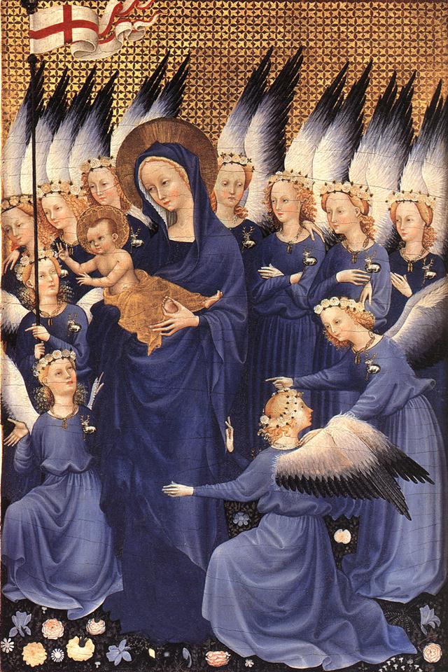
 Wilton Diptych: Virgin and Child with Angels, Unknown French Master, via Wikimedia Commons
Blue was famous during the Middle Ages. People valued the color of the sky, it reminded them of heaven, and its symbolism put it close to gold: it was also the color of divine wisdom, (but gold was used also as light), color of spirituality, calm, contemplation, and all things heavenly. It became also the color of power, but about this on another occasion. Today I will explain the dense code of visual symbolism of the picture above.

Still during 15th century Cennino Cennini, (artist, who was also a writer and theorist of painting techniques) wrote that blue was “illustrious, beautiful, and most perfect, beyond all other colors”.

People talked and wrote a lot about this color. It was considered extremely beautiful and working good on human psyche, it was praised a lot. Also blue pigment was extremely expensive, and for this reason people talked about it in a very different context: painting was a business like any other enterprise, and business talks and written contracts regarding  commissions in which using blue was necessary, specified how much blue should be used. Blue pigment was almost as expensive as gold, sometimes more than gold. It had a beautiful name: ultramarine. It was imported from a valley which is today Afghanistan, made from nothing less than high quality semi-precious lapis lazuli stone, also used in jewelry. The poetic name ultramarine means "from beyond the seas." The stone was extremely difficult to grind, which added to the high price of the pigment.

Artists wanted to make sure how much of ultramarine was to be used, on which parts of the painting. Because of the high price of the pigment, and together with red it was usually reserved for painting robes of the Madonna and Jesus. This example is saturated with blue. Blue was specially the color of French Gothic, especially Late Gothic. Many Madonnas in French art had blue robes, after times of purple and red. (Red for Madonnas’ robes was used more often in the North).

What is the symbolism included in this painting? You know already about gold as diving light and wisdom, blue as divine wisdom and contemplation, things heavenly. This picture is about joys of heavenly existence. First, we have the banner of victory, the banner of resurrection. The colors represent purity of the soul, the sins of humanity washed clean with blood of love ( the sacrifice on the cross) . Wreaths of white roses on the heads of angels symbolize purity and joy of heavenly life. The broaches of the stags represent Jesus: stag means purity and destruction of evil (stag tramples on evil and destroys it). Black on of angels wings stands for depth of the divine mystery. 

Flowers: white rose represents purity and is the flower of the Virgin. The iris was also her emblem, and daisies stand for baby Jesus, his purity and innocence. A lot about purity, right? The vegetation was also emblem of purity; the Virgin was often shown in a garden, which was her emblem, hortus conclusus, "enclosed garden," symbolizing her virginity. Garden had also other meaning starting from early on in Christian art: it was representation of heavenly paradise.

This painting was commissioned for King Richard II. Here the Virgin looks like a fine courtly lady surrounded by ladies in waiting. During Medieval times adoration of the Virgin and courtly love had often similar visual and linguistic vocabulary.

Sunday, March 25, 2012

Symbolism of Color, Medieval: Red, Blue, White and Gold History of Color # 4

During the Middle Ages the idea of splendor and light was extremely important in material creative expression. Very rich vocabulary was  used to describe light in art theory and in theology. Colors were seen as a part of symbolic expression, they were not supposed so much to imitate nature, as it happened later, during the Renaissance, but the goal of using colors was to express an ideal reality. Therefore was not much interest in showing shadow in art, but a lot of interest in showing the most possible clarity in colors. Paints were even mixed such way that they stayed as close as possible to the ideal hue of the best of pigments. And beauty was a representation of some kind of ideal reality, was it  luxury of secular art, or visionary and also luxurious  world of religious art. This ideal reality was thought to exist in colors, and colors had, in opinions of medieval people, their own inner light.

This thinking about the  ideal essences of things was the legacy of the Classics, of Plato and than of Plotinus. I hope not to make things too complicated, but symbolism, philosophy, iconography, mysticism, theology, and technicalities of making art were all  interconnected.

Medieval art put extreme emphasis on purity of colors. When digging deeper in art history we will see that there were some differences between Latin Christianity and the  Byzantine Christianity, but in general color ruled the art world.

Raw pigments, powdered metal. Yes, I prepare some of my paint from time to time, like in old days.

You see here the four most important colors of the Middle Ages. Yes, gold was considered a color, unlike today. Speaking of hues, we have almost primary colors, red, blue and yellow, as gold is close to yellow, and was replaced by cheaper yellow sometimes. Plus a neutral: white.

I start this part with two of those powders on the picture, (one raw pigment, one metal powder), which were relating to light: white and gold.

White: symbolized light, also  in theology which influenced art. White was a symbol of purity, innocence and renewal of spiritual life. During the early Middle Ages angles were shown as white, but later were colorful. It truly depends on time and place: later Middle Ages had colorful angels. Also the elders of Apocalypse, robes of Jesus, prophets, newly baptized people, considered innocent, the righteous people, Jesus in moment of transfiguration. But Jesus was not always shown in transfiguration in white robes only, Middle Ages had codified symbolism, but not rigid rules.

St Sever Apocalypse manuscript. Public domain, courtesy of French Wikipedia
 This example shows white as light (stars),  and as a symbol of innate purity as seen in  this white lamb from St. Sever Apocalypse manuscript.

Gold: as white was more representing physical light in the world, and also had symbolic meaning, the divine light was gold. The light reflecting properties were used freely, not only for decorative purposes but also to communicate theological truth, to show light out of this world. As the divine light was closely relating to the idea of absolute divine wisdom which it represented, the backgrounds of paintings and mosaics are golden. But not always, blue was used too. Gold symbolizing divine light represented spiritual illumination, and to indicate this state of blessedness, connection to the divine, or divinity itself. Halos were golden most of the time. But also there were halos painted blue.

 Here is the link to Hagia Sophia interior video. for those of you on whose search engines videos embedded in this blog do not show.Hagia Sophia means the Holy Wisdom in Greek, and it was the most magnificent church in the Constantinople,  the capital of the Byzantine Empire. Usage of gold is befitting the name of the church very well.

Red was color of love in sense of selfless love, like Christ's love fro humanity, agape which is the unconditional love, and blood of redemption and blood of martyrs. Blue was symbol of heaven,contemplation, things which are divine, life lived in accordance to the highest standards. More about those colors later.

 We need to keep in mind that system of  color symbol was not  rigid. There were canons in iconography, but it doesn't mean that the artists were slavishly following them. The philosophers and theologians were interpreting colors quite freely as well, a lot of abstract thinking went into writings about colors. Does it means we can't rely at all on color symbolism in Medieval art? Yes, we can. But we should approach it with open mind, and remember that there are no absolutes. Also the symbolic language of colors in religious art was adopted by secular art, but the meaning of one color in religious art many not be exact the same in secular art. For example white was worn by French queens as the color of mourning. Purple was color of mourning too, in addition of symbolizing royal, or imperial power.

A very informative article about color http://renaissanceclothing.blogspot.com/2011/02/meaning-of-renaissance-and-medieval.html in Renaissance and Medieval  clothing. Not only is the author very well informed, but also gives warning not to interpret things too rigidly.